Author: krushton

RFID card music player (Yoto clone)

For the last few years running, the hottest holiday toy for the under 5 year old set has been an RFID-powered music player like the Yoto or Toniebox. Kids love the freedom to choose what to listen to and parents love that their children get to enjoy media without the overstimulation of screens (or having one of their kids’ first words be “OKGoogle”.)

I looked into buying one of these for my toddler twins, but at $100+ it’s a tough sell, especially since the underlying tech is pretty simple – just a hardware box with an RFID scanner and a wifi enabled speaker. I’d actually built something similar in a grad school project, except it was a teddy bear and the focus was learning games and not music (Fuzzy Logic). Also, the products charge a LOT for the “build your own” cards feature, which uses blank RFID cards that the parent maps to media of their choice – even though blank RFID cards can be purchased for under 50 cents.

Enter my app, Spotify Cards. This app takes advantage of the fact that most Android phones have built in RFID readers on them. It also uses the Spotify Player API for Android to play songs in the background on Spotify. Using this app, a parent (for now, me :)) can buy packs of blank RFID cards and link them up to Spotify songs, creating a delightful and simple replica of the Yoto player experience. I typically launch the app and then lock the screen using the Android screen lock feature, so the kids can listen to music unattended.

Admin Interface – Adding Cards

SpotifyCards List View
Main view is a list of added cards. Tapping the card will play the selected song on Spotify.
Actions
Swipe on the list item to take action – edit or delete
Add or update cards
Add or update card view. To link a song, a user can simply paste in the “Share” URL from Spotify for ease of use
List empty state
Empty state/welcome screen for card list
Onboarding screen
Once launched into player mode, the user is prompted to scan a card.
Player screen
While the song is playing the UI is very simple and adapted for non readers. All that is shown is a track image and two controls for pausing/playing the music and resetting.


Demo Video

Here it is in action! Note – this is showing the V1 UI before I finished the more polished design.

DIY toddler sink

The Backstory

I have twin toddlers who are tall for their ages, but not tall enough to reach a bathroom faucet. Normally a step ladder would work, but I have only one bathroom and it’s too small for a ladder to be left in place permanently.

We made do for a while, but hoisting a 35lb toddler up awkwardly each time they need to wash their hands was getting old (for anyone not familiar with toddler life, that’s approximately 1214891 times per day).

I looked online for a solution to buy. There are a handful of examples of Montessori style sinks but most have a water pitcher or 1 gallon lemonade-dispenser style jugs on top of the sink, which would need to be refilled too often for my taste and are also too likely to be tipped over by curious hands.

The Idea

I started drawing up a design for a toddler-height sink with running water that could be placed in an open space in our laundry room outside the bathroom – no plumbing required. The main idea was to use a battery powered pump and 5 gallon bottle as the core of the sink mechanism, and build a basic frame around it.

I initially wanted to include a jug for the used water as well, but realized that wouldn’t fit into my space constraints. I also wanted to build sides and a door but decided not to for simplicity and also to keep the space nicely aired out – water and enclosed spaces generally being a bad thing.

The Solution

  • a battery powered water pump (rechargeable via USB). Amazon sells it under a bunch of different brands but as far as I can tell they’re all the same. for example:  Electric Water Dispenser
  • a 5 gallon water jug
  • wood frame – I used .5inch plywood for the base and stud boards (2″ by 3″) for the posts
  • a toy bin with a rimmed edge (8×11.5″) commonly sold on amazon (also IKEA has them) – for example: Toy Storage Bin
  • contact paper to cover the top – a marble effect would be cute, example
I am NOT handy with physical tools, but I can use digital ones. I started modeling in Sketchup. This let me verify that the initial measurements were correct and my idea would actually work in physical space.

DIY toddler sink model back


Measurements
  • the depth of the sink front to back must be at least 19″ to allow enough space for both the water jug and the toy bin
  • the width of the sink is 15″ in my design
  • the top and base are .5″ plywood
  • the height of a the sink minus the feet is 19.5″. my kids are tall, so I planned for another 2.5″ to be added as feet to raise the sink up slightly (eventually I ended up using an equivalent height concrete block below the jug instead of adding feet, but feet would have looked much nicer, just ran out of time).

The Result

It’s not pretty, but it works! The kids love their new sink. The real winner moment was a few days after I finished, one of my sons (2 years old) finished his dinner and asked to get down, then entirely on his own went and washed his hands before going to play. Success!
Toddler using sink


Note: the sound that the pump makes is nowhere as loud as this video makes it seem!

Relish all screens

Relish

I recently made the switch from Sketch to Figma, after using Sketch as my daily driver tool for over 6 years. I was a little nervous about the transition, so I signed up for a training course on Udemy. The final assignment for the course was to create a recipe app, with screens for the login flow, recipe browsing, searching, and rating a finished recipe. It was a lot of fun to flex my visual design muscles and learn a new tool at the same time. Here are the screens for my recipe app, Relish.

Select Screens

Relish sign in screen
Sign in Screen
Relish splash screen
Splash Screen
Recipes List
Recipe List
Recipe Reviews
Recipe Detail
Rate and review
Rate and Review


Developing a SaaS site

I’ve decided to build the frame of a basic SaaS site to work on my Angular and design system skills. I’ll be documenting my progress here.

Day 1 – 3hrs

I’m off to a strong start! Today I created a new project in Rails called CardsApp. I don’t actually know what this SaaS site does but since it’s just practice it doesn’t really matter. I spend the bulk of the time today establishing a design system for the site, such as the basic colors, fonts, heading sizes, etc. (using SASS). I also installed Devise, and restyled all of the associated views. Users can now sign up for the site, but not much else.


Day 2 – 2HRS

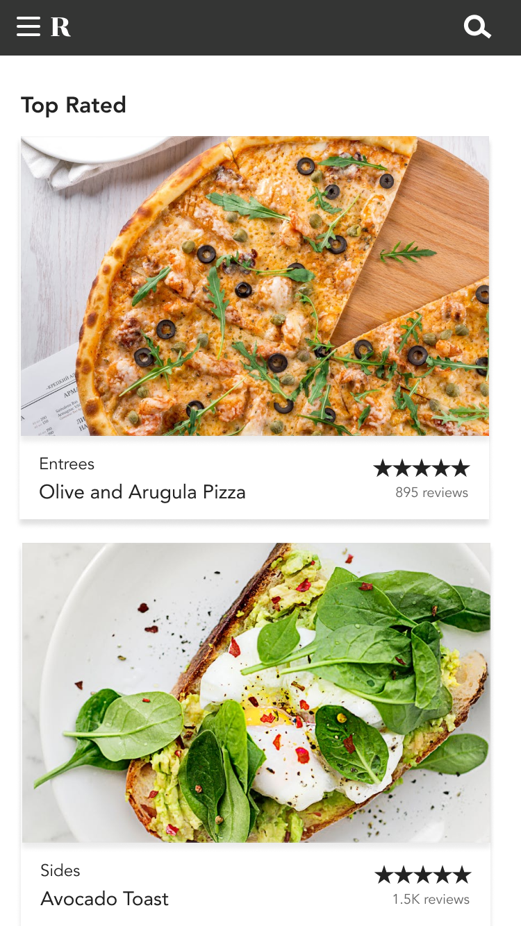
On day 2, I continued working on creating a visual design framework. I added in a bunch more styles for forms, banners, alerts, etc. I also changed the view after the user signs in to show a left nav with some top-level items. I put in a placeholder for the user’s avatar and moved the account-related links there.


DAY 3 – 5HRS

Day 3 was the most work so far, and yet I have nothing new to show. I decided that I want to restructure my app so that only the back-end is delivered by rails JSON APIs, and to write the front-end in Angular.js. In the past when I’ve used rails with server-side templates, it always turns into spaghetti jQuery that is ugly and hard to maintain, so I want to avoid that from the start.

I’ve used Angular before but am definitely still a novice — I only recently started to understand directives. And like many newcomers I am not really sure on the best practices for organizing files (my most recent design prototype has a directives.js file that is 2k+ lines long… oops.)

Since the purpose of this project is to write clear, careful, maintainable code, it’s important that I get the structure right. I refactored my project following the guidelines here: Angular JS Best Practices. The organization the author outlines is similar to what I have seen in large-scale production apps.


DAY 4 – 4HRS

I spent a lot of time today trying to get Devise to play nice with Angular. Devise is very easy to set up with its out-of-the box views so I was hoping there would be a robust angular version of it, but no luck on that front. I did try out a couple different approaches that use the Devise JSON endpoints but nothing seemed to work well, and in the end I decided to just keep the auth system as Ruby/erb and pass what data I need from Ruby to JS via the Gon gem.

I also built my first modular angular component today, an alert toast that replaces Rails’ default flash message. The toast component has properties like message, style (warning, success), dismiss time, etc. that can be passed in.

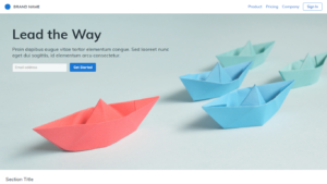
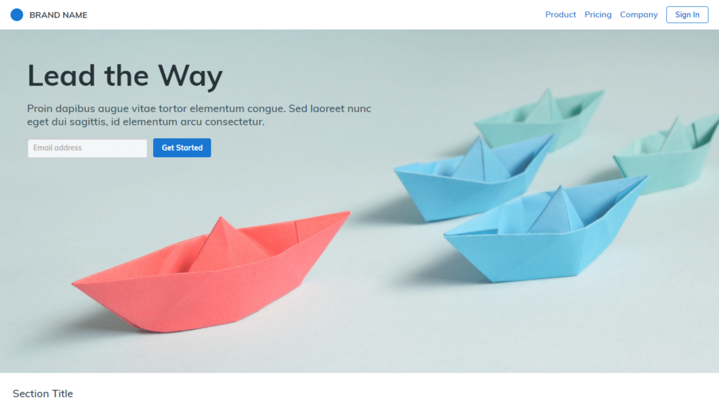
I also designed a landing page… kind of in love with the white, pink, and blue color scheme so I might switch the rest of the app to use it.

DAY 5/6 – 4HRS

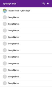
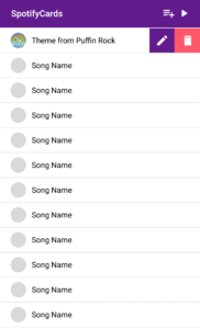
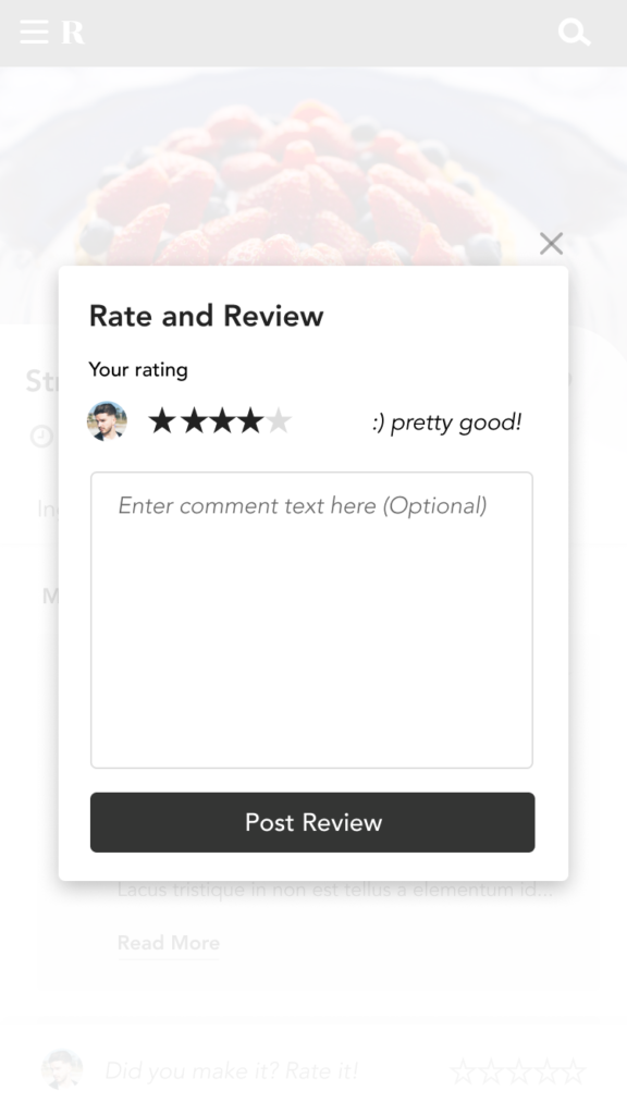
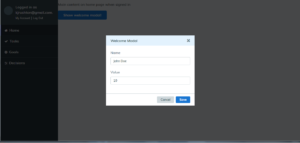
I spent a few hours over the last 2 days working on my next Angular component, a modal dialog. The alert component I made previously was easy because it only has data going into it, but a modal has both an incoming and outgoing state to manage, and requires communication between different controllers and directives…which in angular-land means I needed a service. Luckily there’s an “angular-modal-service” library that makes this implementation relatively painless. I ended up with three pieces:

  • a generic <modal> directive that takes in options like the modal title and style and leaves a placeholder for the modal body content to be inserted via transclusion (in other news, I finally know what transclusion is used for).
  • my template for a specific modal which uses the generic modal directive and includes the new body content
  • the controller which calls the modal service, hooks up the template, sends in some data, and handles the result in a promise.

Fun!

DAY 7 – 4 HOURS

Today I worked on getting my app to integrate with the Google Drive API. My plan was to let users connect to drive and sync data with Google sheets. Google uses Oauth2 for this kind of integration which is always a massive pain, despite the Omniauth helper gem (stackoverflowing intensifies). After a few hours I got it working enough so that I could query my google drive for sheets files and then read in data about them. Unfortunately this is the point when I realized that the API for google sheets is quite massive and will require a LOT of work to make usable. I am not really in the mood to write a whole client library so I’ve shoved all this work in a different branch for now.

DAY 8 – 2 HOURS

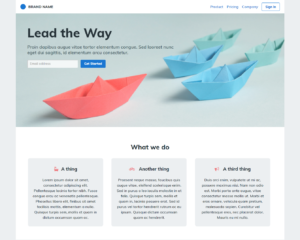
After all that OAuthing yesterday, I wasn’t really in the mood for another hard challenge today so instead I continued working on the design. I restyled the errors and validations for my forms and also added a new section onto the front page with the typical three section blurb.

DAY 9 – 5 HOURS

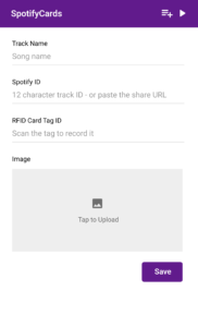
Today I started working on the account edit page. I wanted to make it so that the user will be able to add and change their profile photo and other account details. This ended up being surprisingly tricky, because:

  • I’m using devise for most of the user handling stuff so I needed to create a new controller on top of that to accept AJAX from angular.
  • I needed to store the images somewhere other than my local server, so I got up and running with S3 and the Paperclip gem.
  • Angular doesn’t play well with files, for example ng-model isn’t supported… which makes sense but still required some working around.

Well now we have a landing page, authentication, user management, file storage, and several different views ready to go. Next is the idea for the business itself – the hard part! In any case, this was a good exercise for working with SaaS and learning to make my angular components more modular/reusable.

Fototrackr

Fototrackr is a tool for tracking goals via Instagram. The idea surfaced when I was thinking about New Year’s resolutions. People often make resolutions to improve large, macro level things they don’t like about themselves, such as “lose weight” or “get a better job”… but for me, I like to break things down into specific small goals like learning a new skill, visiting a new city, trying new foods, and so on. So Fototrackr was a way to list out all of the things I wanted to do and keep track of each one as I ‘complete’ it by uploading photos on Instagram.

How it works is very simple:

  1. Sign in to the site via your Instagram account
  2. Add goals to the goals page. Each goal is assigned a goal number.
  3. Do awesome stuff
  4. Upload a photo to instagram and tag it with the goal number
  5. Return to Fototrackr to see and share your progress via your goal profile page

Main Screen

Goal Profile Page

 Goals Home

Unfortunately, after I worked on the site for a while I realized that some quirks in the Instagram API ToS would prevent Fototrackr from being approved to leave sandbox mode, so it won’t go live in is current form. But it was still a fun little weekend project.

Trackyard

This summer I planted my first vegetable garden, with moderate success. The hardest thing as a beginner gardener is to know a) what to plant, b) when and where to plant it in your yard, and c) how often to water it.

When I was planning out the garden I looked around for an app I might use to learn about plants and manage my garden, but all of the existing offerings on the Android app store looked terrible and had mediocre reviews.

I decided to use this as a design exercise, with the goal of creating a fun and user-friendly app targeted at beginner gardeners. I had a lot of fun working with a warmer color palette and the use of public domain line drawings for a ‘down to earth’ aesthetic (pun intended). In my day job I work on data analysis tools for Enterprise customers, largely for the desktop, so working on a consumer mobile app (even if it’s just a pretend one) was a nice change of pace.

My favorite innovation is the plant diary, is a feed where you can take photos of the plant as it develops, log when you water it, add notes, etc. This summer my corn plants grew over 6′ tall, it would have been fun to take regular photos from the same angle to watch it grow.

Sign up

splash   artboard-1-copy   artboard-1


Onboarding

artboard-1-copy-2   artboard-1-copy-6   artboard-1-copy-8   artboard-1-copy-16   artboard-1-copy-4   artboard-1-copy-9


Adding plants

artboard-1-copy-12       artboard-1-copy-13   artboard-1-copy-14


Managing the Garden

artboard-1-copy-10  artboard-1-copy-17  artboard-1-copy-15

Trulia++

When I was first starting to search for a house, I consulted online forums to find out which real estate search engine was recommended, and learned that pretty much everyone uses a mishmash of sites to take advantage of differing feature sets. In my searches, I have personally used Zillow for property and rent estimates as well as properties out of the U.S., Trulia for its superior mapping features and wider reach, and Redfin for its superior mobile app.

But all of these sites fell short when it comes to truly personalized search, particularly if we were targeting investor users. Since every investor has different priorities, ideally sites that cater to them should allow sorting and filtering by custom, weighted criteria including:

  • list price
  • list price vs # of bedrooms ratio
  • neighborhood crime statistics
  • school ratings
  • walk score
  • cost per door (for investment properties)
  • comparison of price to zillow or redfin’s estimated value
  • potential rent
  • data about nearby businesses (for example, number of restaurants, distance to a grocery store, etc)

Trulia does offer a lot of this data, but only in its property listing page, not from the search results. I can understand why they designed it this way (as we noted when working on StreetSavvy, using crime statistics in an algorithmic way can be politically charged). Even so, it does save a lot of time to have all of this data surfaced to the search results page, instead of having to click back and forth.

Trulia ++ is a chrome extension (unreleased) that runs on top of the search results on Trulia.  Using Chrome devtools I was able to locate the JSON array of search results and run each property through my own analysis with rules like:

  • calculate a total score based on # of bedrooms, bathrooms, location, crime stats, etc. compared against price
  • give multifamily properties a higher weighting than single family
  • hide single family homes if over 150K
  • hide auctions

I then display the results in a custom sidebar juxtaposed with the Trulia map.

Main Interface

Main interface. Clicking the big blue button runs an analysis on all of the visible properties.

Each search result has the a lot information crammed into a small space, including the property type, delta between list price and Zestimate, crime and school ratings, and more.

Search Results

Each listing condenses multiple data points into an overall score, as well as surfacing some key facts

Leavethe.us

Leavethe.us is an international job search tool. I originally created it in 2012, and then later refined the interface for a more modern experience.

I developed the site after I realized that the Indeed.com API provided the ability to query its job database by country, a feature not offered by the company’s main website. After the first version was ready I posted it on the IWantOut subreddit on reddit.com and received some feedback that I incorporated into the site.

V2 Interface

Leave the US - Front page

Leave the US - Map

V1 Interface (circa 2012)

leavetheus

Rocket Fares

Like most people, I love to travel. When I have time to kill I often find myself clicking around Kayak’s Explore feature, just to daydream about future vacations and see what kind of flight deals are out there for the next few months.

At one point it occurred to me that I was missing a key piece of information – that in order to truly find the best deals, I needed to be able to compare not only the price of flights, but also how far each flight went for a given amount of money. This makes intuitive sense, as a flight out of San Francisco that costs $500 may or may not be a good deal depending on whether it is going to LA or to Tokyo. But for some reason, no existing airfare search site formalizes this mental math by providing an actual distance to price ratio for their search results.

So, in order to make this happen, I made a chrome extension to run on top of Kayak Explore that runs the Haversine distance formula for every flight search result and replaces the raw fare price amount for each result with the price expressed as miles per dollar. This allows me to compare all flights on equal footing, and making it clear that a flight from SFO to New Delhi for $405 (18 MPD) is an objectively better deal than one from NYC to Hongkong for $532 (15 MPD).

kayak

I then created Rocket Fares to share my best finds with the world (and also to get more practice with WordPress Development).

Finally, I automated the entire process, so I can create a new post directly from the chrome extension… including sourcing images and adding affiliate links to purchase tickets (My First Content Farm!)

Rocket Fares chrome extension

Fish DB

This summer I participated in the first annual Fishackathon, a two day event that brings coders together to work on projects for sustainable fishing and ocean preservation. The hackathon was held in many cities across the US, and was sponsored by the U.S. State department in participation with local aquariums.

Fishackathon intro

As part of this event we got to eat, sleep, and code inside the Monterrey Bay aquarium which was a once in a lifetime experience.

Fishackathon 10492589_10102982545297119_2307275031998189476_n

My group tackled the West Africa problem statement, which was the need for a technological solution for managing fisheries on the west coast, primarily in Ghana. Before writing any code or even sketching out designs, we reached out to the creators of the problem statement to understand more about the needs of this unfamiliar user group. We learned that smart phones are not very wide spread (though most people have feature phones), internet access is unreliable, and many of the fisherman are illiterate, so we needed to take all of these into consideration for the design.

The end result was Fish DB, a mobile web app featuring a simple graphical interface that let fishermen register their boats, apply for fishing licenses, and report illegal fishing. We also implemented submission by text for users without smart phones, and an admin interface so that program administrators could manage incoming requests and reports.

My role in the project was to collaborate on the design, and I was also the primary programmer for the Ruby on Rails web app. After winning the local event at the Monterrey Bay Aquarium, our group advanced to the final round where were delighted to be selected as the grand prize winner for the whole United States!

Article on Berkeley ISchool website: http://www.ischool.berkeley.edu/newsandevents/news/20140616fishackathon

fishackathon-screenshot-1 (1)Fishackathon 1