For the last few years running, the hottest holiday toy for the under 5 year old set has been an RFID-powered music player like the Yoto or Toniebox. Kids love the freedom to choose what to listen to and parents love that their children get to enjoy media without the overstimulation of screens (or having one of their kids’ first words be “OKGoogle”.)
I looked into buying one of these for my toddler twins, but at $100+ it’s a tough sell, especially since the underlying tech is pretty simple – just a hardware box with an RFID scanner and a wifi enabled speaker. I’d actually built something similar in a grad school project, except it was a teddy bear and the focus was learning games and not music (Fuzzy Logic). Also, the products charge a LOT for the “build your own” cards feature, which uses blank RFID cards that the parent maps to media of their choice – even though blank RFID cards can be purchased for under 50 cents.
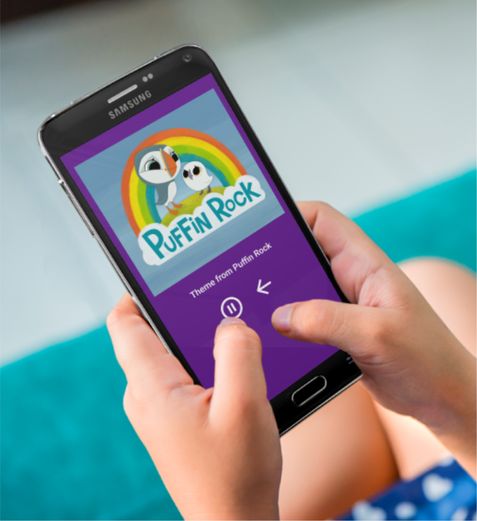
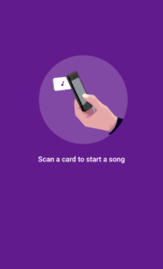
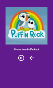
Enter my app, Spotify Cards. This app takes advantage of the fact that most Android phones have built in RFID readers on them. It also uses the Spotify Player API for Android to play songs in the background on Spotify. Using this app, a parent (for now, me :)) can buy packs of blank RFID cards and link them up to Spotify songs, creating a delightful and simple replica of the Yoto player experience. I typically launch the app and then lock the screen using the Android screen lock feature, so the kids can listen to music unattended.
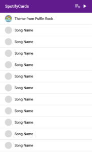
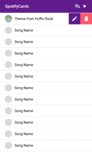
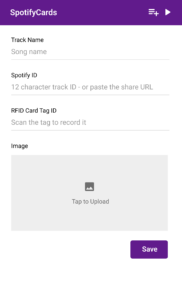
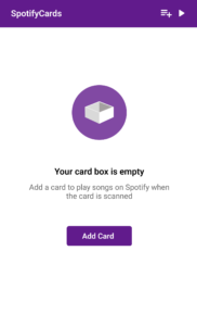
Admin Interface – Adding Cards
Demo Video
Here it is in action! Note – this is showing the V1 UI before I finished the more polished design.

